Web Designers Run Amok; or, How To Slam the Door in Your Reader's Face
ORR Home > Articles > Technical Writing > Web Parasites
01 Nov 2000; Dennis G. Jerz
Web design is a good thing; but web authors who overemphasize
design frequently end up skimping on -- or even subverting
-- their content.
My university supplies thousands of networked machines with a standard configuration. Assuming that I had the desire, time, and skills to upgrade a browser, I don't have the necessary security clearance to upgrade software -- and neither do the thousands of students at my university.
To exclude the average user from a particular web site, or to give the average user substandard treatment, is to violate a fundamental principle of the Internet. While specialized web pages can and should speak to specialized audiences, the Web is the phenomenon it is today because so many ordinary people can use it.
Technological Arrogance
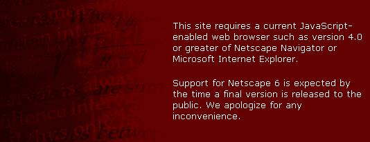
If you don't have the latest computer equipment, Jupiter Media Metrix apparently doesn't think you deserve to read anything at all on their web page. In preparing my "Jupiter Communications" set of pages, I tried to do some research on Jupiter Media Metrix. When I tried to visit www.jmm.com, the door was (metaphorically) slammed in my face, as the following screen capture shows.
| How Jupiter Media Metrix welcomes me to their web page (Windows 2000, IE5, with Webwasher).
What's this? No link to a plain-text, more-accessible version; no e-mail link to a webmaster who might be able to answer questions. Not even a telephone number or snail-mail address. An executive from Jupiter Media Metrix who found my critique of a Jupiter Communications press release chastised me via e-mail for making an erroneous assumption about his company. If his company hadn't paid an expensive web designer to exclude me from its web site, perhaps I wouldn't have distressed him so much. (If somebody else out there can access http://www.jmm.com, please tell me about the mysterious wonders it hides from my unworthy eyes. But beware -- I hear tell that the home page breaks the "go back" button. -- DGJ) |
It's the Stupid Design
Jason Cranford Teague has written several articles that I find useful (see Teague articles, below), including one which contains the following bit of advice:
While great design can not overcome poor content, bad design can obscure even the best content. (Teague, "It's the Content Stupid")
Teague is absolutely right; but he also apparently agrees with poet Ralph Waldo Emerson's claim that "A foolish consistency is the hobgoblin of little minds." Teague's home page is an obstacle to, rather than a menns of, delivering his content. Those who are unfortunate enough to choose the wrong browser are treated either to a chaotic distortion of the home page, or to a software crash.
Teague's site in IE (WinNT, Spring 2000)


In the above design, a very wide left margin nicely highlights the logo; I prefer not to waste valuable home-page space in this manner, but plenty of people have told me that my own pages are too crowded; further, I have to admit that this page looks nice. But the most noteworthy design element is the pop-up boxes, which emulate the behavior of the menu bars in Windows and Mac desktop applications.
I first discovered this problem when, feeling penitent for having critiqued Teague's work on the online Journal Kairos, I asked my students to read one of his excellent articles about typeface design. About half of my students chose to view Teague's site in Netscape, and this is what they saw:
Same page, viewed in Netscape (WinNT, NS4, Spring 2000)

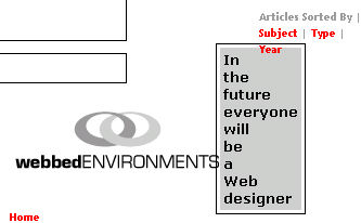
The problem seems to be that Teague spent so much time ensuring that his menu bar worked smoothly on Internet Explorer, that he either did not know or did not care what his page looked like to Netscape viewers. During the classroom discussion, some students offered the opinion that Teague didn't know what he was talking about. Once I told my students to switch to Internet Explorer, they were able to view his pages and use his menu system; but I doubt that many of them would have known (or bothered) to do so on their own.
While Netscape has clearly lost the browser war, those who are clinging to Netscape's wreckage certainly don't deserve the following treatment:
Same page, viewed in Netscape (Win2000, NS4, Fall 2000)

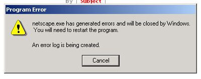
The download process halts, the reader gets an error message, and Netscape crashes. Since the crash seems to come when the menu is partially displayed, I suspect that the menu widget is somehow related to the crash.
Useful Teague Articles
Why am I picking on Jason Cranford Teague so much? It's nothing personal. As an academic, I a large part of my profession involves critiquing. Further, I regularly ask my students and my colleagues to critique my own work, and I welcome corrections and rebuttals from anyone. But being critical is not all about being negative. Teague offers a visual perspective on web authorship that I (as a text-based thinker) simply cannot offer; hence, I highly recommend the following Teague articles:
- Typography
on the Web -- Introduction
"While we can theoretically use any font we want on the Web, there are three distinctive ways that to present text each with its own strengths and weaknesses." - Browser-Safe
Fonts
"Look around the Web and what do you see? Two fonts: Helvetica and Times... I am sick of them." Teague offers suggestions for alternatives to the two most reliable, but least exciting, typefaces. - It's
the Content, Stupid
"While great design can not overcome poor content, bad design can obscure even the best content."
Related Links
Dave
Winer
[Writing for the web is too damned hard.]
"I can't handle it. It's too much work, too much to remember.
That's why my website sucks, and yours too. Because I look
at the wrong words on my screen and decide that it's too much
trouble to get it right."
Dennis G. Jerz
Learn to Fear Jupiter Communications!
If this
press release represents the kind of thinking that comes
out of this company, I suggest that you run screaming from
the unbounded evil that Jupiter Communications represents.
Dennis G. Jerz
On
the Web, a KISS is still a KISS
Want to launch a business that makes a
really huge impression? Put the cash register on
the roof. (Why not? It will create a lasting
impression!)
Dennis
G. Jerz
01 Nov 2000 -- first
posted
19 Apr 2001 -- minor modifications
15 Oct 2001 -- minor edits
