Kairos Critique [ Intro
| Requiem | Formal | Comparative
| Justification ] [About
this site]
Requiem
for a Useful Critical Target
<!-- Need to keep from sounding too much
like a jerk... Who am I to tell the editors of Kairos what to do with their
web site? I want to use the directness and bluntness of the online
medium, but I don't want to annoy respectable academics. -->
<!-- I know! How about a deliberately pompous,
satirical tone? It creates a lighter atmosphere, but without diluting
the message with too much chitchat. Think T. Herman Zwiebel, from
The
Onion. OK, here goes. -->
 Although
I continue to mourn the loss of the old Kairos, I was heartened
to see that the "current issue" page (which, as I write this, features
Kairos
4.1) uses style sheets to get rid of that pesky link underlining.
I just hate it when hyperlinks are so easy to find. Since most of
the text is red, how wonderfully the few non-linked words jump off the
screen!
Although
I continue to mourn the loss of the old Kairos, I was heartened
to see that the "current issue" page (which, as I write this, features
Kairos
4.1) uses style sheets to get rid of that pesky link underlining.
I just hate it when hyperlinks are so easy to find. Since most of
the text is red, how wonderfully the few non-linked words jump off the
screen!
I
had never thought of annoying readers by making unvisited links red, and
visited links a different shade of red. It's fun to see people
squint at the screen to identify a color change that they can barely notice.
Oh,
how sweet it was, back when the Kairos frames were so obviously
pointless... back when my students, trapped deeply within an internal page,
could click on the logo in the upper left corner of the uppermost frame,
and watch as the logo expanded in size! (We don't need no steenkin' "home"
links.)
<!-- Is the elegiac tone working?
Do I need to throw in a few smileys or IMHOs? -->
 |
Yet
now, when I click on the Kairos icon, what happens? From top-level
pages, it leads to the home page; from inside the current issue, it takes
you to the current issue table of contents. It's disorienting when
clicking the same icon can result in two different actions. In a perfect
world, the "VOL 4 ISS 1 FALL 1999" image that sometimes appears beneath
the Kairos logo
could take you to that issue's table of contents;
at present, it does nothing. |
The
home page features a useful "current issue" box; however, if you click
on the "Issue Archive" link, the new page features an almost identical
box, in the same location, with the same contents. If you aren't
paying close attention while the page loads, it almost looks like nothing
has happened. Further, unless you have a really big screen, or know how
to read the size of a page by the size of the scroll bar tab, you wouldn't
know that boxes representing the other issues are lurking farther down
on the page.
<!-- I'm obviously stretching here.
These are legitimate design questions, but they aren't serious enough to
prevent me from using the site... Let's try something else. -->
The
very concept of waiting for an "issue" makes little sense in the online
world. If one of the articles is ready to go, why hold it back for the
others? If an interesting letter to the editor comes in, why not
make it a part of the issue upon which it comments, instead of saving it
for months later? And another thing...
<!-- Oh, forget it. I call up the
Kairos home page now, and it looks... functional! The badness of
Kairos used to be so clear... now I have to provide too much context in
order to illustrate the design weaknesses. -->
<!-- Kairos, kudos to you for being what
you are. Curses to you for evolving, and therefore recklessly depriving
me of a useful critical target. Hey... this coverweb about hypertext
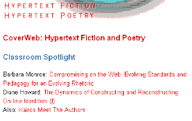
fiction looks interesting... [** click **]
-->
Dennis G. Jerz
Kairos Critique [ Intro
| Requiem | Formal | Comparative
| Justification ] [About
this site]
 Although
I continue to mourn the loss of the old Kairos, I was heartened
to see that the "current issue" page (which, as I write this, features
Kairos
4.1) uses style sheets to get rid of that pesky link underlining.
I just hate it when hyperlinks are so easy to find. Since most of
the text is red, how wonderfully the few non-linked words jump off the
screen!
Although
I continue to mourn the loss of the old Kairos, I was heartened
to see that the "current issue" page (which, as I write this, features
Kairos
4.1) uses style sheets to get rid of that pesky link underlining.
I just hate it when hyperlinks are so easy to find. Since most of
the text is red, how wonderfully the few non-linked words jump off the
screen!