Kairos Critique [ Intro
| Requiem | Formal
| Comparative | Justification ] [About
this site]
Publishing
an online journal in semi-annual "issues" dilutes the impact of the medium.
In 1996, the same
year Kairos was born, web designer David Siegel was riding
high on the success of his seminal book, Creating
Killer Websites. More recently, Siegel has sung a different tune:
"I am not trying
to win any design awards for my clients any more."
Why
no more killer websites? Presumably because visitors rarely appreciate
being killed. Although online writing is still an emerging genre, computer
gurus who know next to nothing about composition theory and textual rhetoric
have, almost by trial and error, stumbled upon a set of online writing
conventions that describe the most successful and popular Internet sites.
To depart from these expectations is to frustrate the reader. [See
Jakob Nielsen, "How
Users Read on the Web."]
Many
early academic notions about the hypertext reader's alleged desire to explore
or the empowerment of readers liberated from the author's structure simply
do not match the expectations of the vast majority of people who spend
their time using hypertexts. If the purpose of Kairos is to
distribute scholarly information, then the journal would better serve
its readers by following lower-tech, lower-profile HTML strategies that
do not impede the message.
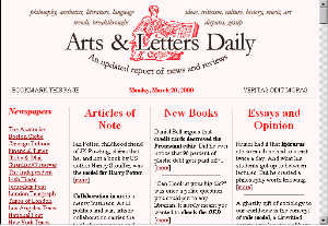 |
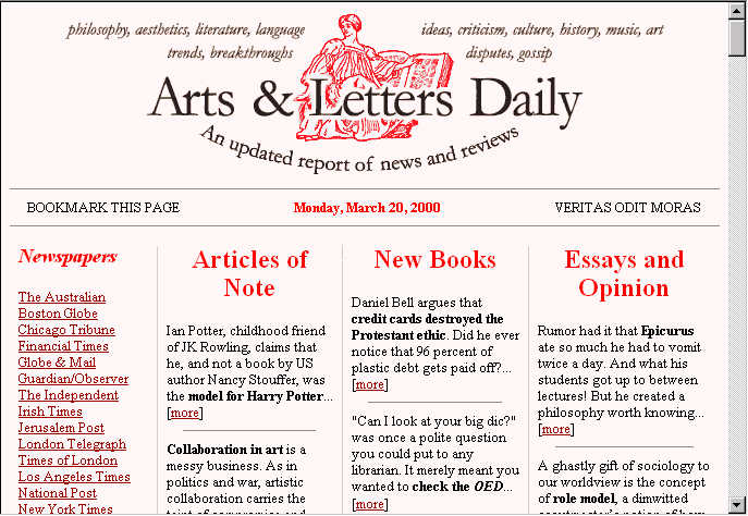
Arts
& Letters Daily offers blurbs about articles appearing elsewhere
on the Internet. New material appears at the top of the column; older
entries slide down the page, eventually ending up in an archive.
While
the cheesy graphic eats up a lot of space on the first screen, the site
doesn't bore repeat visitors with a lengthy mission statement. The
editors stand demurely in the background, letting the content speak for
itself. Even the ads are subtle -- you can't even see them in this
screen capture!
(I have shamelessly duplicated this model on my own home
page, which features
links
about online and offline literacy.) |
| This
site, useit.com, looks a bit amateurish...
and if you don't already know who
Jakob Nielsen is, you'll be puzzled by the purpose of his his site
(which is to promote Nielsen's consulting business). Nevertheless,
visitors can quickly locate old articles in the left column, and watch
for new material on the right. All articles are written in inverted
pyramid cyberstyle, with ample bulleted lists and bold keywords for
scannability. |
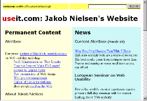 |
| Only
a few of his many articles are of direct interest to writing teachers;
yet his simple, no-nonsense table of contents (with informative,
practical titles, rather than clever, obscure ones) greatly simplifies
navigation. A new column appears every two weeks, but in the intervals,
a "Spotlight" section offers paragraph-length mini-articles that comment
on current events (but of late have been used to promote Nielsen's personal
appearances, thus offering less value to the causal reader).
Search Box Usability: On March 13, 2000, I e-mailed Jakob Nielsen to tell
him that six of my freshmen spent 8-30 minutes looking for information
on his web site, and all six complained that his site didn't have a search box
-- all six had missed the plain-text link in the upper left corner of the page.
|
With
all due respect to the professional achievements of Kairos editorial
board member Jason Cranford Teague, I am one of the many who cannot stand
HTML frames and JavaScript doodads. Further, like everyone else who
goes online in order to find information, rather than to explore aimlessly,
I had no desire to experiment with Kairos in order to make sense
of its innovative features. Many people cringe when they encounter
web sites with large ornamental graphics, pop-up windows, and flashing
banners; why? Because marketers use such devices in order to wrench
our attention away from the things we really wanted to do instead.
I
finally realized what a wonderful cautionary tale Kairos could be.
So much talent, so much time, so much thought went into the creation of
Kairos.
Yet it reminds me of some of Eugene O'Neill's more notable theatrical failures
-- the ones that George Jean Nathan said "sink not trivially but with a
certain air of majesty, like a great ship, its flags flying, full of holes."
Oh, the humanity!
I
used to enjoy dropping hints about the mythological Kairos search
engine (only available through a JavaScript windoid). Oh, how frustrated
my students grew. Now, a search box is ready and waiting on every
one of the top-level pages. I also used to show students a page where
an editor, responding to a "frames suck" FAQ, assured visitors that there
was in fact an alternate, non-framed version of the site but neglected
to provide a link to it. Now, Kairos framing is shockingly
subtle; a modest band to the left of the screen orients the reader and
features links that are actually useful. If Kairos continues
to improve at this rate, I shall have to find another
target.
See also: Undergraduates
Review Kairos; Undergraduates
Review This Site
Dennis G. Jerz
Kairos Critique [ Intro
| Requiem | Formal
| Comparative | Justification ] [About
this site]
