The exercise of inviting students to join me in critiquing Kairos is a useful model for the kind of interactive feedback loop that I suspect Kairos wants to generate. (I also invited my students to critique this web site, and tried to improve it accordingly).
Note: This web site does not present the results of a full-fledged usability study (such as the usability test "GoodDocuments.com" conducted on itself). Instead, I simply asked my students to tell me what they thought. Even under such informal conditions, their responses revealed many of the weaknesses of the latest Kairos design.In general, students who were asked to look at and evaluate the Kairos web site "professional" and "crisp"... but at the same time, "intimidating," "a hassle," and "confusing". One student even commented, "Some of the sentences were pretty wordy and hard for me to understand, however, if this page is intended for teachers and college graduates in that particular field, it may be just fine." Note -- this student is talking about the journal's home page, not about the content of any of the articles! [See also: Parting S
|
|
I asked my students to look at Kairos and describe the strengths and weaknesses of the Kairos web site (as of early March, 2000). Some of the longer comments offered valuable design advice: "This site would be better if color, arrangement, and different size fonts were used to create hierarchy and draw readers in." Others focused on the user experience: "The site, while it looks good, does not offer a first time visitor a lot of help."
About half of the comments were rather superficial, such as the following, quoted in full:
Paired
comments (each from the same respondent) illustrate some of the students'
main points. Emphases added; some passages have been edited
for length, but typos have not been corrected.
|
|
|
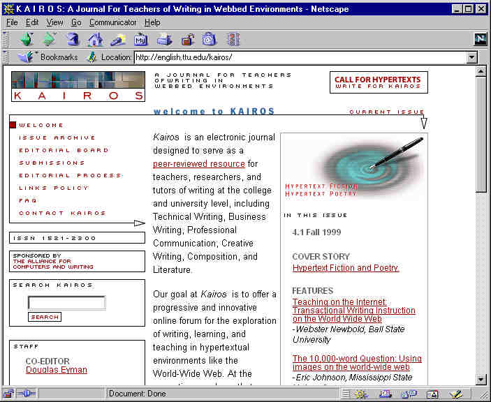
| Each subject can be found at a glance. table format is friendly | If you want to read about Kairos its is a hassle to scroll down the page because the information is written in only the center colunm. |
| It starts off telling the reader what Kairos is and what its goal is. It also highlights what articles are in the journal, ordering them from most important to least important. | Nothing really stands out, including the title. There is nothing the catch the readers eye. Everything is pretty much the same font and style. |
| Nice (and unobtrusive) logo at the top. Easy to find search box. The navigation bar works good for moving around the site. | Text in the middle is not easily read being in a narrow collumn. The window on the right seems to be cluttering up the page. It doesn't scale well to the 1024x768 resolution. |
|
|
|
| I thought that this site did a good job of explaining what Kairos was all about. I liked how along the way you could click into different links that would explain certain things in more detail. | I thought the site looked very crowded. With all the different links I could get into I didn't know which one to get into first. |
| (The following students each noted a tension between the first impression and their actual experience using the site.) | |
| First impression is that the site looks very sharp. The site is tight,
without being too tight. Links to other pages are situated near the top
of page with the more important links being larger and underlined. The
site
does a good job of placing bodies of text in long columns so as not to intimidate readers. ... |
... In some cases, especially where the columns are narrow, this becomes extremely obnoxious to read. If the text was made to run across the width of the whole column it would neatly package all the text into a box that makes it both easier to read and cleaner looking on the page |
| It appears to be very professional, clean and it incorporates graphics as well as the thin division lines. It has a site search function and a navigation table in the upper left. | The site, while it looks good, does not offer a first time visitor a lot of help... The format is a little confusing too. It is divided into three equal columns and nothing is stressed to be read first. |
First posted Mar. 16, 2000
Dennis
G. Jerz